/ data & cartography
February 2026 – Housing cooperatives are gaining momentum in the Netherlands and are increasingly seen as a potential response to the current housing crisis through renewed forms of collective ownership and collaborative housing production.
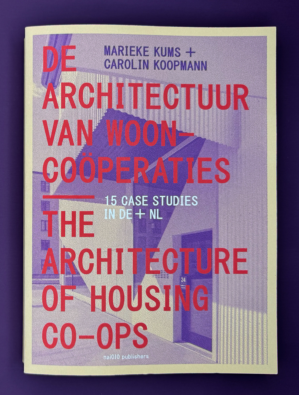
Well-documented examples are essential to inspire and support emerging initiatives. This book presents 15 successful housing cooperatives —10 from Germany and 5 from the Netherlands, including San Riemo (Munich), Boschgaard (Den Bosch), and De Nieuwe Meent (Amsterdam). By Marieke Kums and Carolin Koopmann, published by nai010
Trust in Numbers
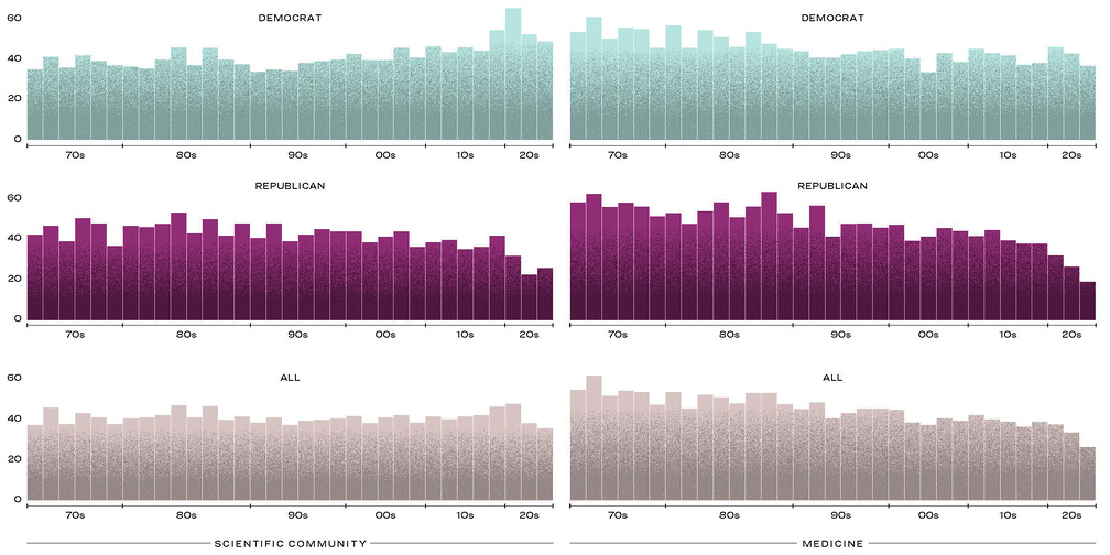
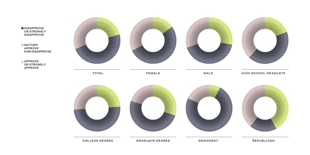
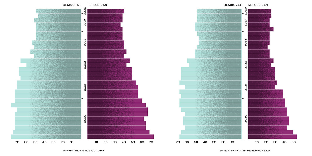
November 2025 – Infographics for the print issue of Harvard Medicine magazine on the crisis of trust in science and medicine.
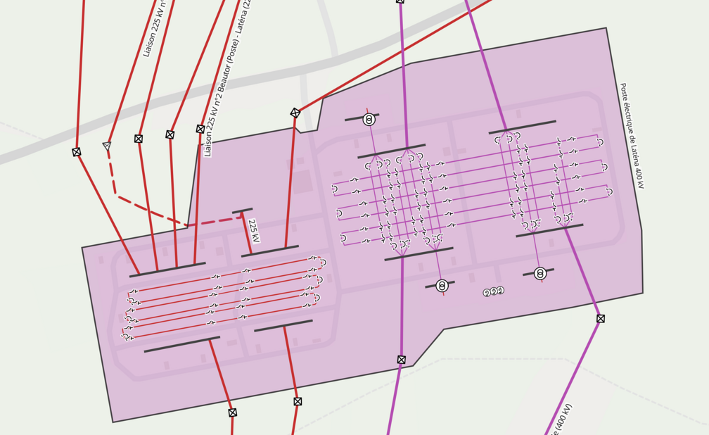
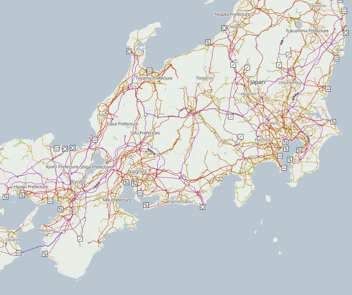
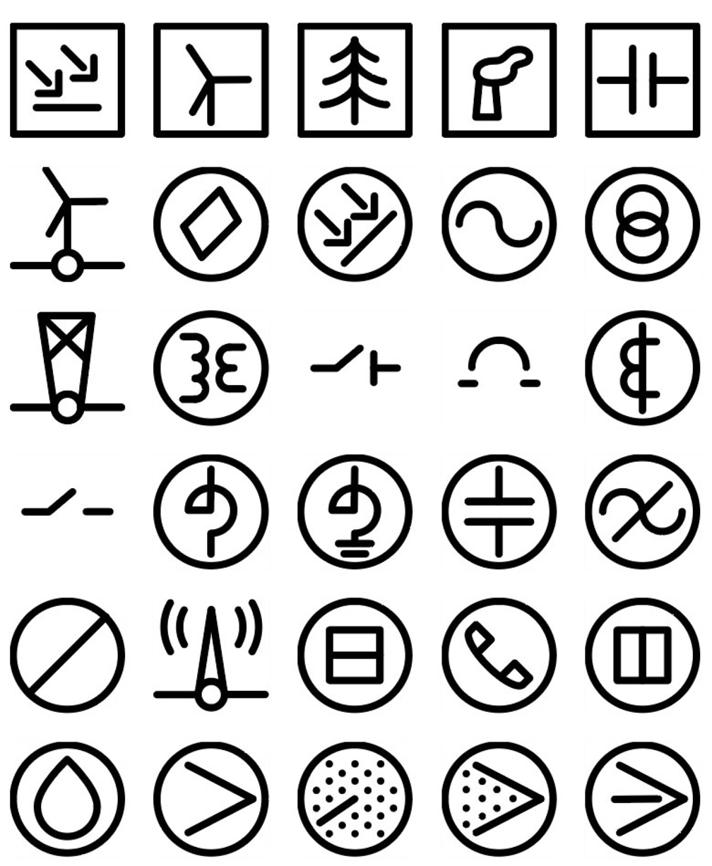
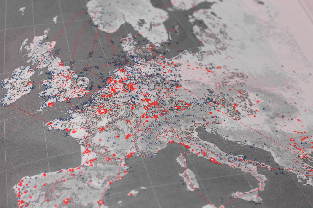
September 2025 – Icons and limited glyph set for Open Infrastructure Map, a view of the world's infrastructure mapped in the OpenStreetMap database.
STADSKLAS
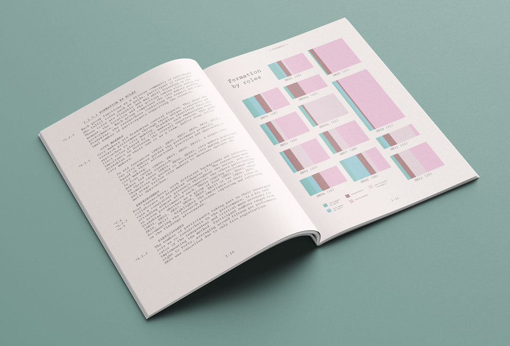
August 2025 – Bookdesign for Willemijn Lofvers' PhD research STADSKLAS. Experimental learning of transdisciplinary practitioners in dramaturgical arranged urban situations.
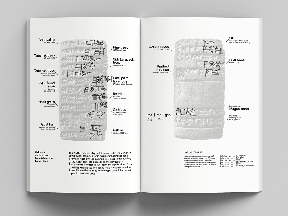
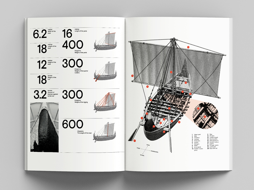
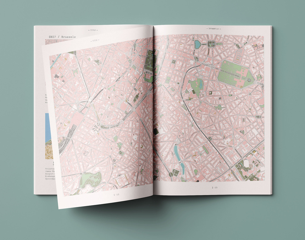
July 2025 – Infographics and cartography for Magan rediscovered, a publication from The Zayed National Museum, the national museum of the United Arab Emirates, chronicling the 'Magan Boat Project', a joint initiative with Zayed University and NYU Abu Dhabi launched in 2021. The project resulted in the reconstruction of an 18-meter Bronze Age ship that sailed from the coast of Abu Dhabi.
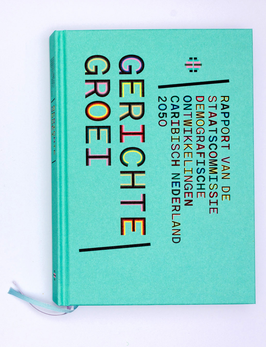

July 2024 – Design for final report of the Dutch State Commission for Demographic Developments 2050 (Caribbean Netherlands)
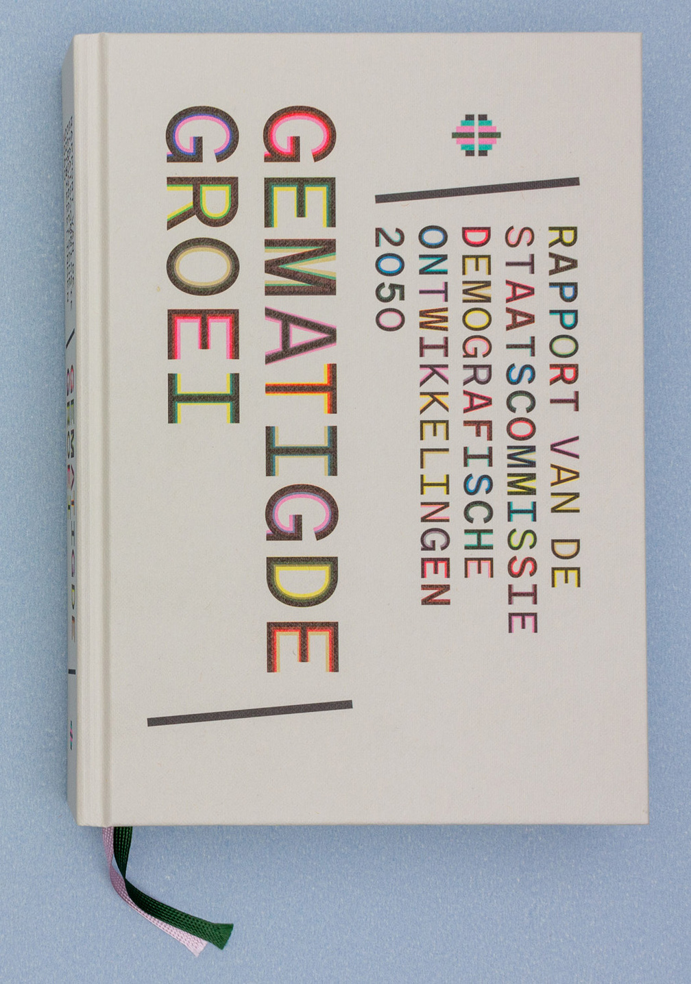
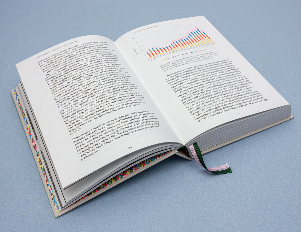
January 2024 – Design for final report of the Dutch State Commission for Demographic Developments 2050
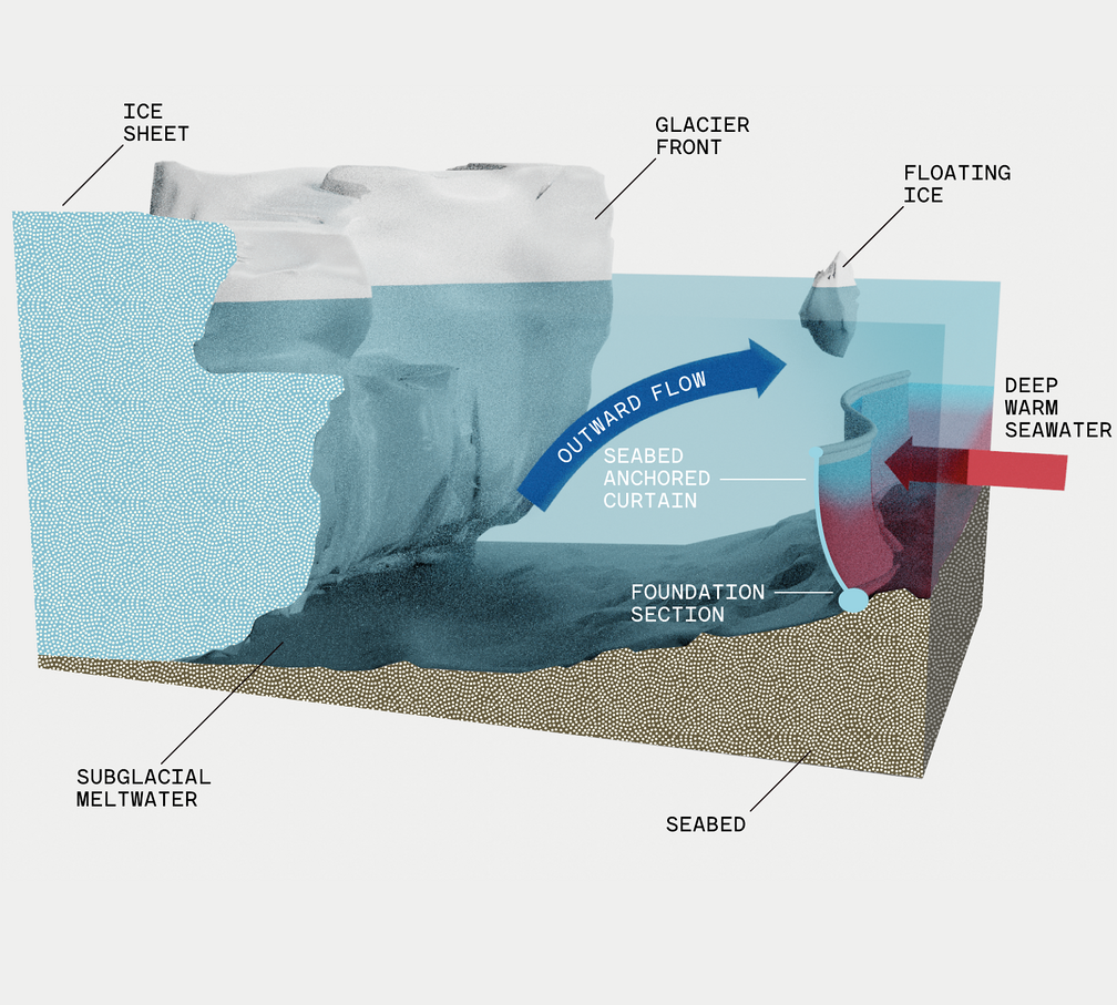
Can $500 Million Save This Glacier?
January 2024 – Information design for New York Times -- A bold engineering project might show a way to slow sea-level rise — and bring new imagination to the fight against climate change.
Encounters
March 2022 – Maps for "In Focus", the Photographic Journal of british photographer David Yarrow.
Encounters
June 2021 – Maps for "In Focus", the Photographic Journal of british photographer David Yarrow.
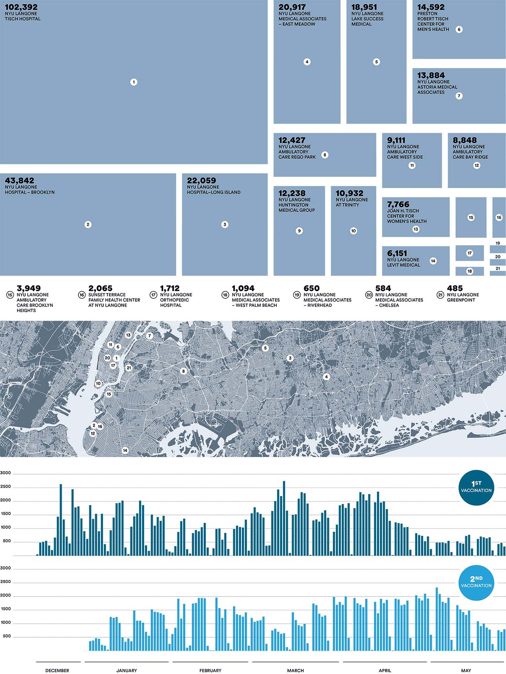
NYU Langone
June 2021 – Infographic for the NYU Langone Health Magazine, New York (USA).
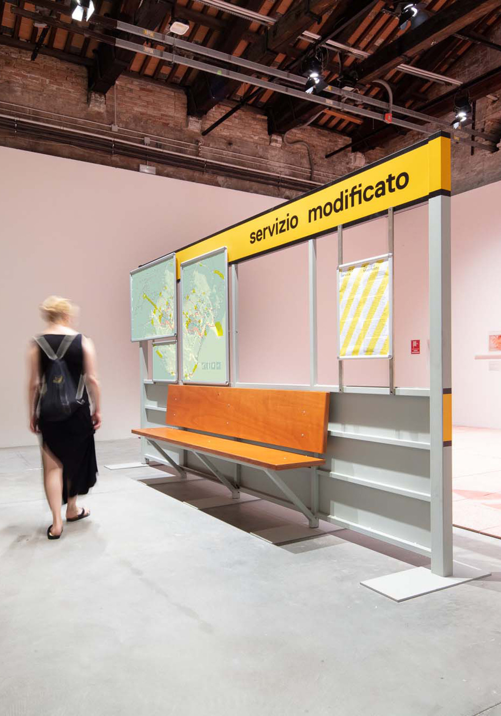
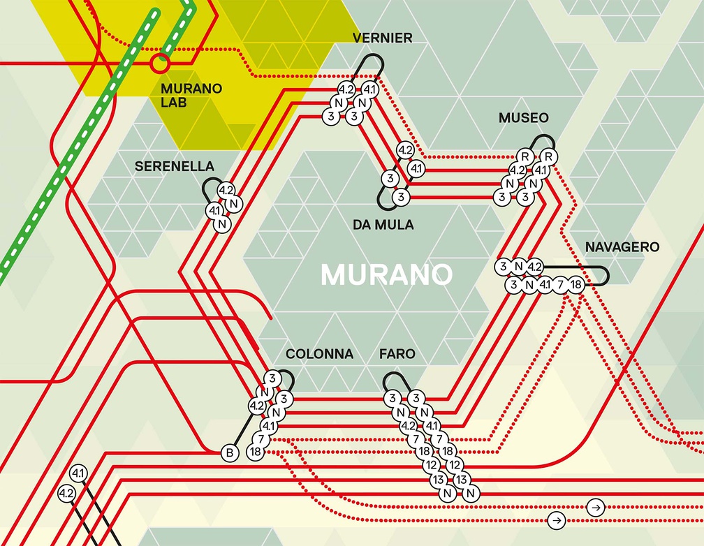
June 2021 – Cartography for "Servizio Modificato" (Modified Service), a collaboration with Kathryn Moll and Nicholas de Monchaux of modem (USA), Sandro Bisá of Bisá Associati (IT) and William Sherman of the University of Virginia Venice Program (USA/IT).
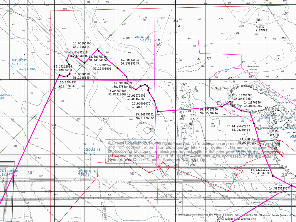
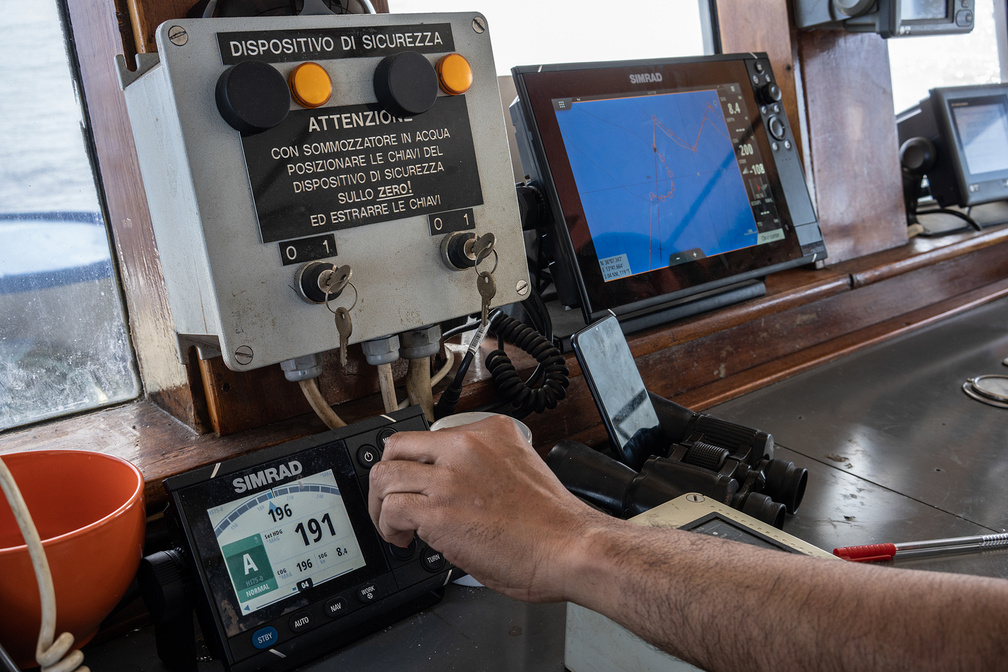
May 2021 – Cartography for a performance by artist Rossella Biscotti that has taken place in the Mediterranean Sea between 20 and 23 May 2021. The Journey is a performance of a ship navigating a GPS content-related route inspired by time, history and current geopolitical data researched together with different experts and communities in an area of the Mediterranean Sea between Italy, Malta, Tunisia, Libya. The narrative is centered on the decision and consequences of dropping a 17-ton marble block awarded to the artist by the iconic Michelangelo quarry in Carrara, Italy, yet left untouched.
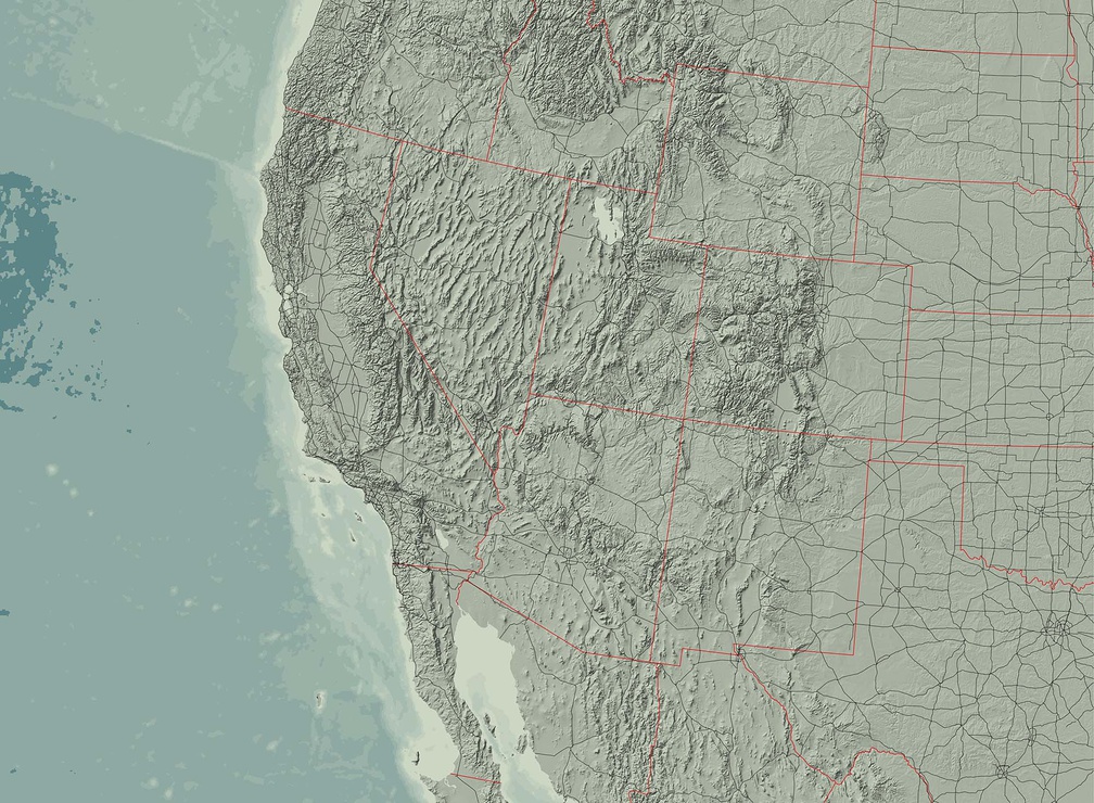
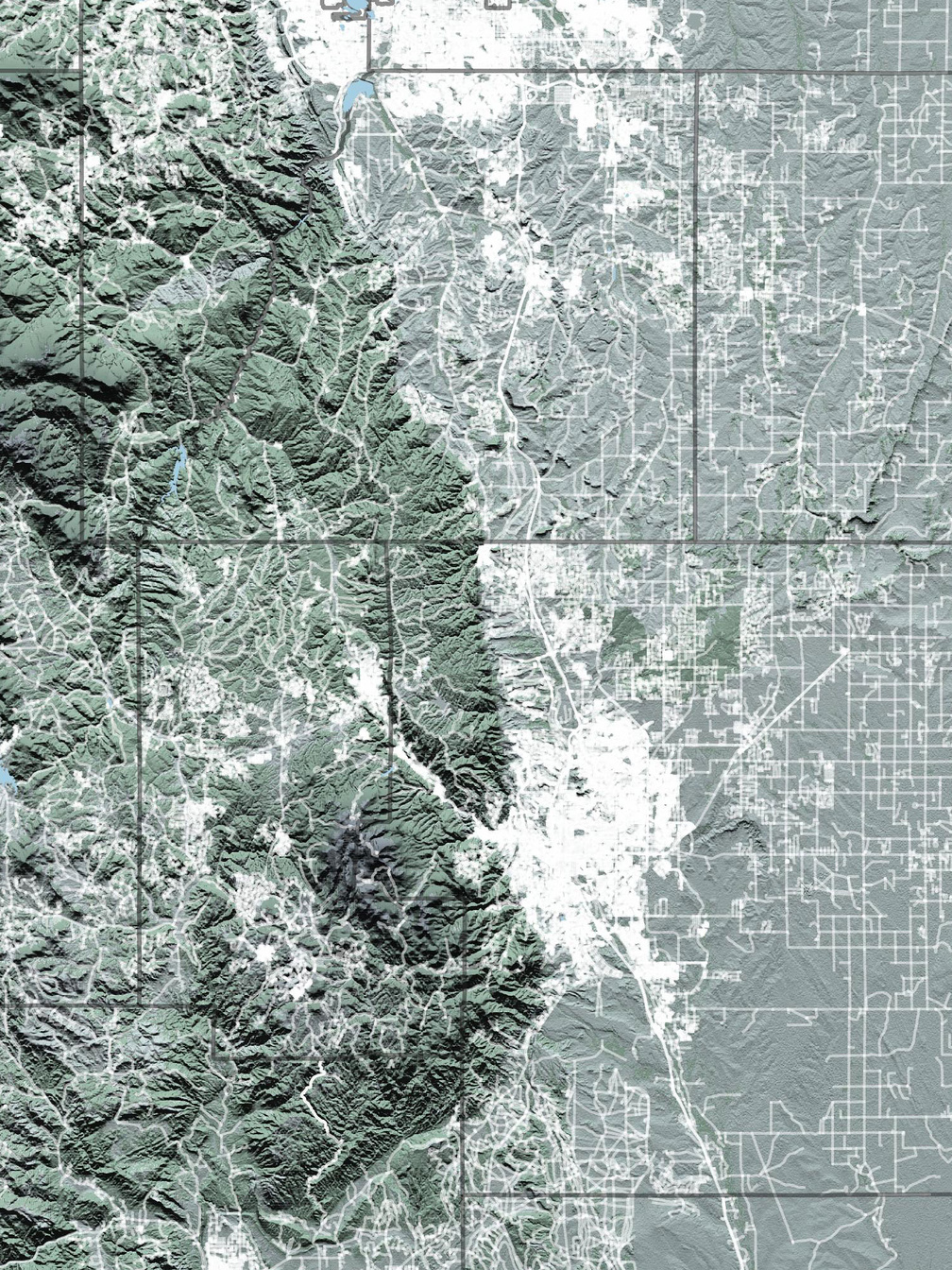
Montana
November 2020 – Montana map for "In Focus", the Photographic Journal of british photographer David Yarrow.
West Africa
November 2020 – West Africa map for "In Focus", the Photographic Journal of british photographer David Yarrow.
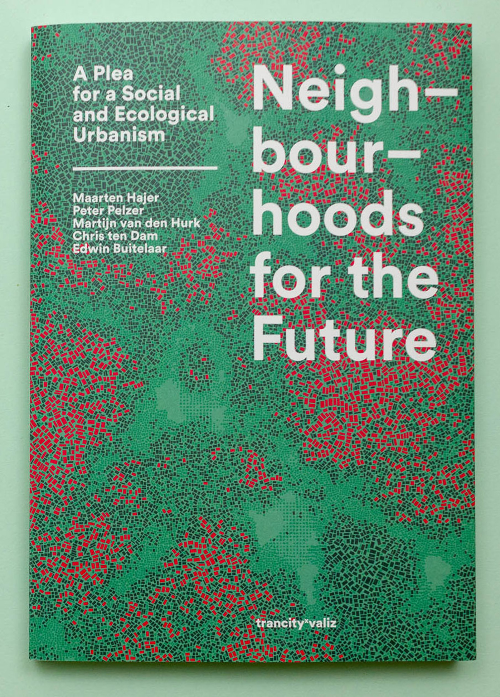
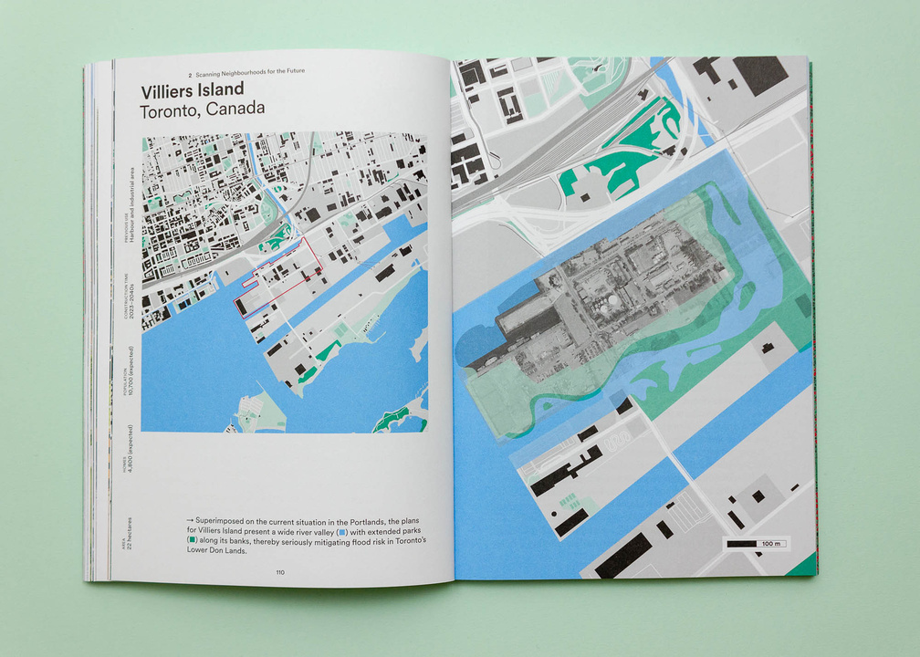
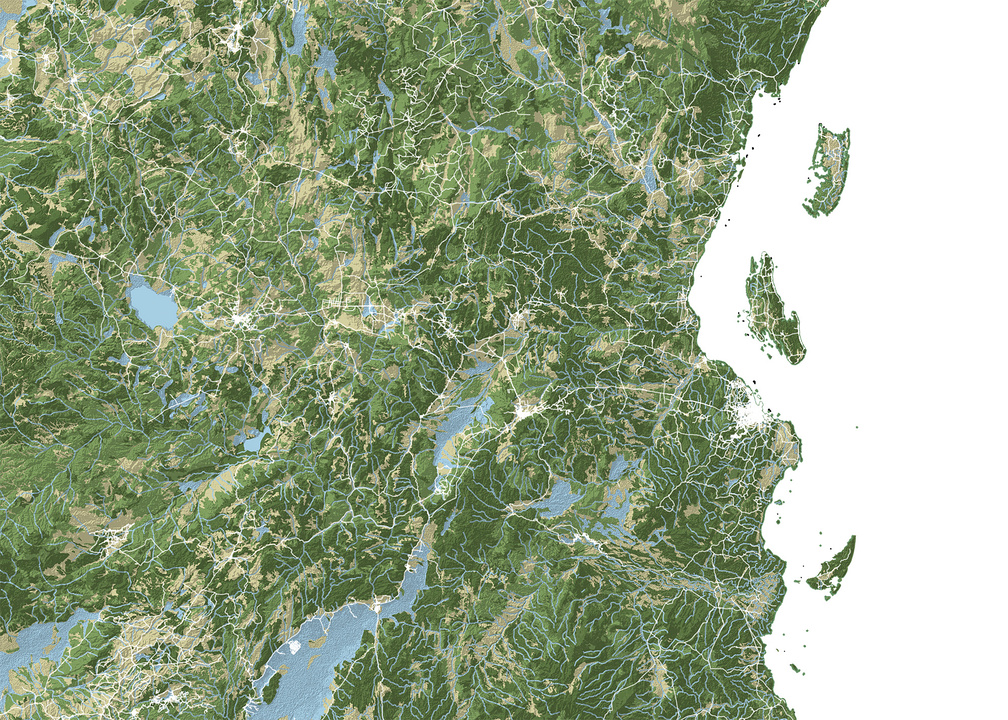
November 2020 – Book Design and cartograhy for 'Neighbourhoods for the Future, A Plea for a Social and Ecological Urbanism'. On the city, urban change and the public domain. Authors: Maarten Hajer, Peter Pelzer, Martijn van den Hurk, Chris ten Dam and Edwin Buitelaar.
Mediterranean Sea
September 2020 – Map aggregation and map reprojections for artist Rossella Biscotti project "The Journey" -- a performance of a ship navigating a GPS content-related route inspired by time, history and current geopolitical data researched together with different experts and communities in an area of the Mediterranean Sea between Italy, Malta, Tunisia, Libya.
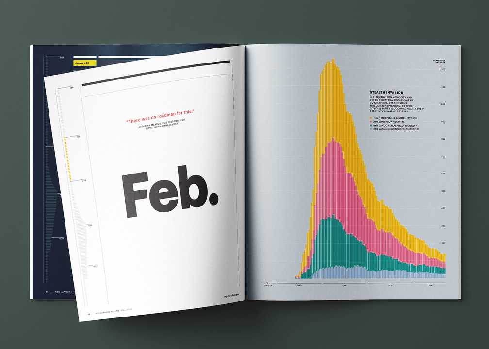
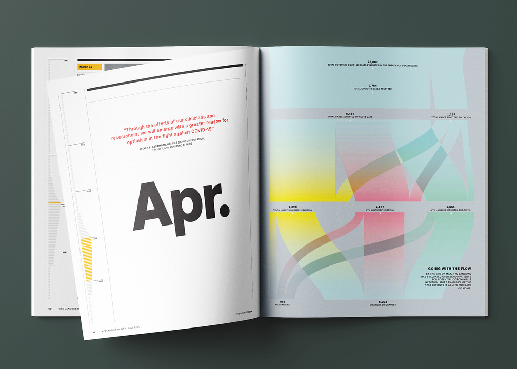
July 2020 – Infographics and openers for "How We Saved Lives", a special issue of the NYU Langone Health Magazine, New York (USA).
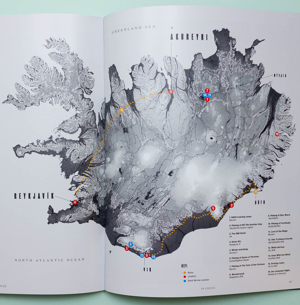
Iceland
June 2020 – Iceland map for "In Focus", the Photographic Journal of british photographer David Yarrow.
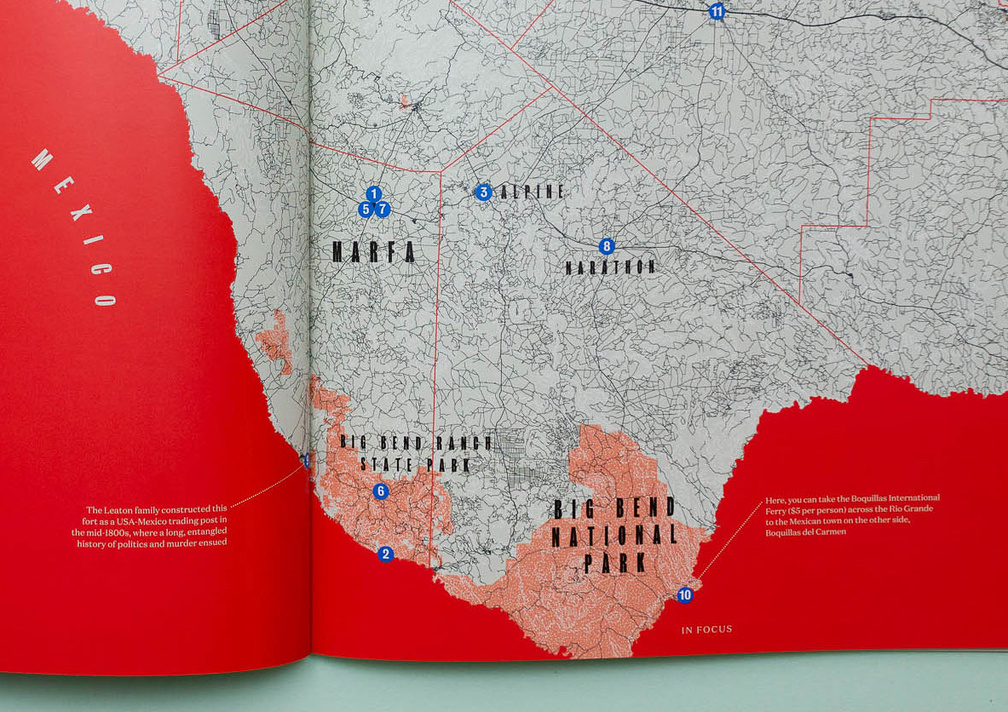
West Texas
June 2020 – Texas map for "In Focus", the Photographic Journal of british photographer David Yarrow.


How competition makes us creative
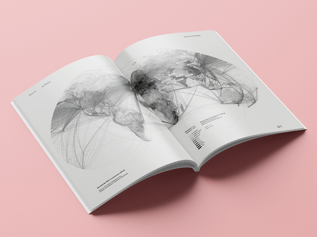
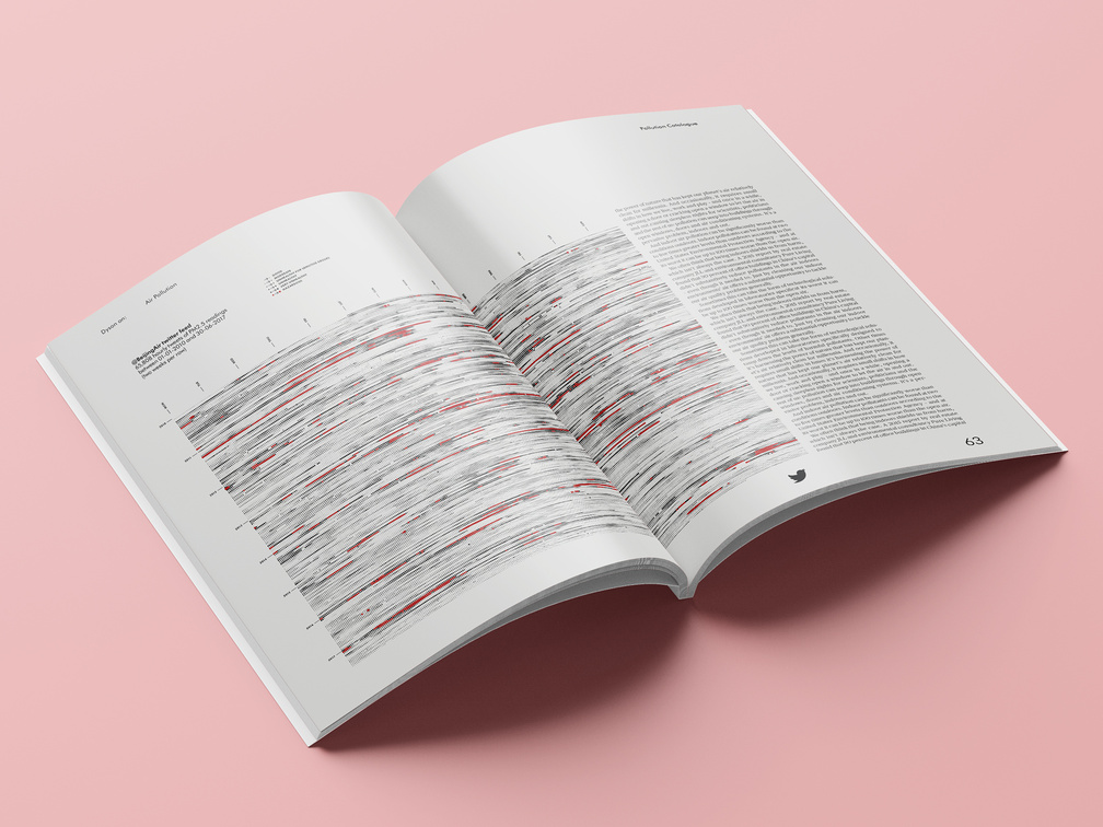
July 2019 – Graphics on air pollution for the second issue of Dyson on: Magazine.
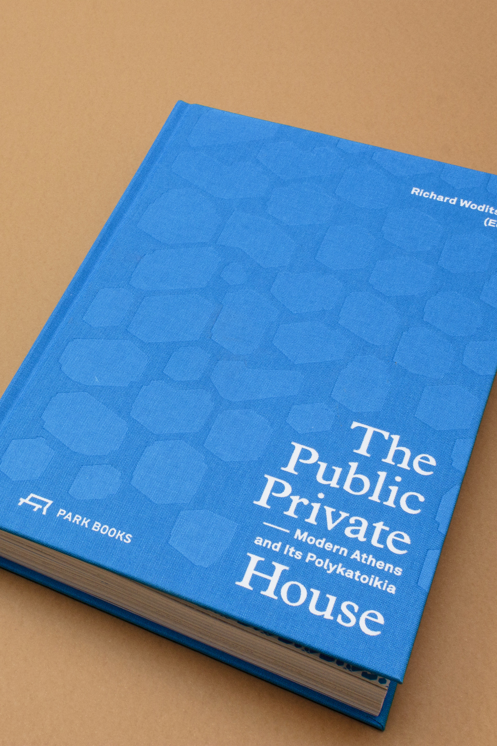
September 2018 – ‘The Public Private House’, edited by Prof. Dr. Richard Woditsch and published by Park Books, Zurich (CH), examines the building typology of simple apartments blocks, the ‘Polykatoikia’, that define Athen's signature housing structure. On the shortlist for ‘Die schönsten Deutschen Bücher 2019’.
Twenty years of KAAN Architecten
June 2018 – Video on the occasion of their 20 year anniversary for KAAN Architecten, Rotterdam (NL). In collaboration with Plaatsmaken (video editing) .

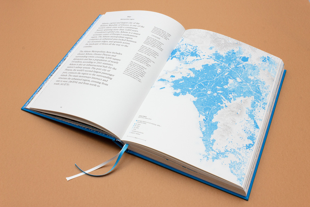
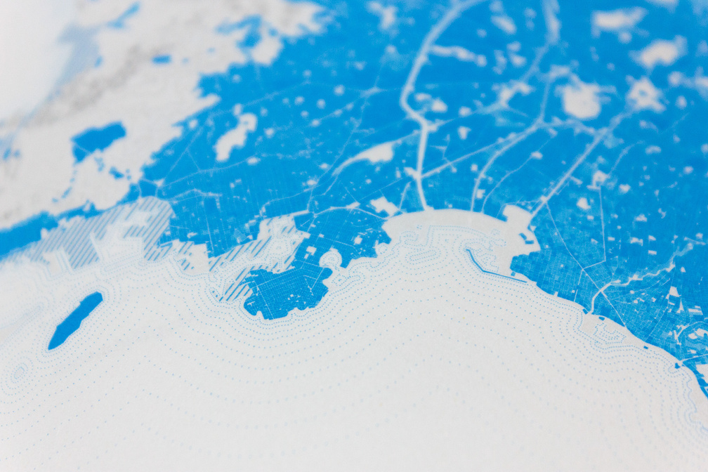
October 2017 – Book Design for ‘Urban Challenges, Resilient Solutions’ in which the ‘Future Urban Regions Lectorate’ offers designers, their commissioners and (local) governments new models and ideas to deal with healthy urban development. Published by trancity*valiz.
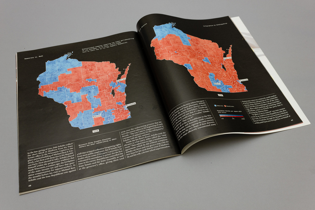
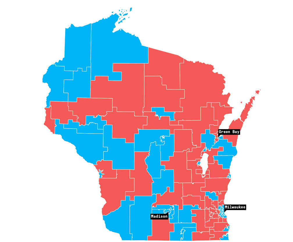
September 2017 – Maps and charts on the Wisconsin State Assembly elections for an article about Gerrymandering for New York Times Magazine.
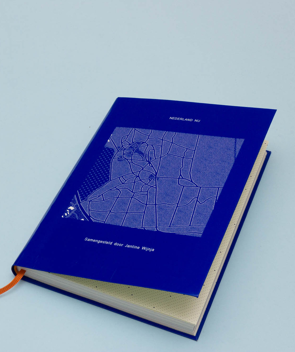
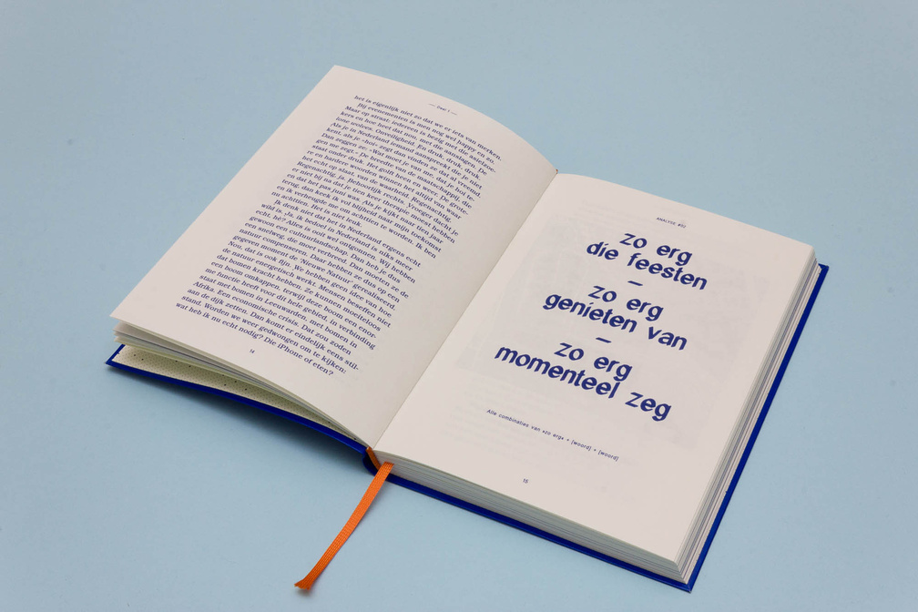
June 2017 – Book Design, text analysis, machine monologues and maps for ‘Dit Is Nu’ (‘This is Now’), an ongoing project of Jantine Wijnja.
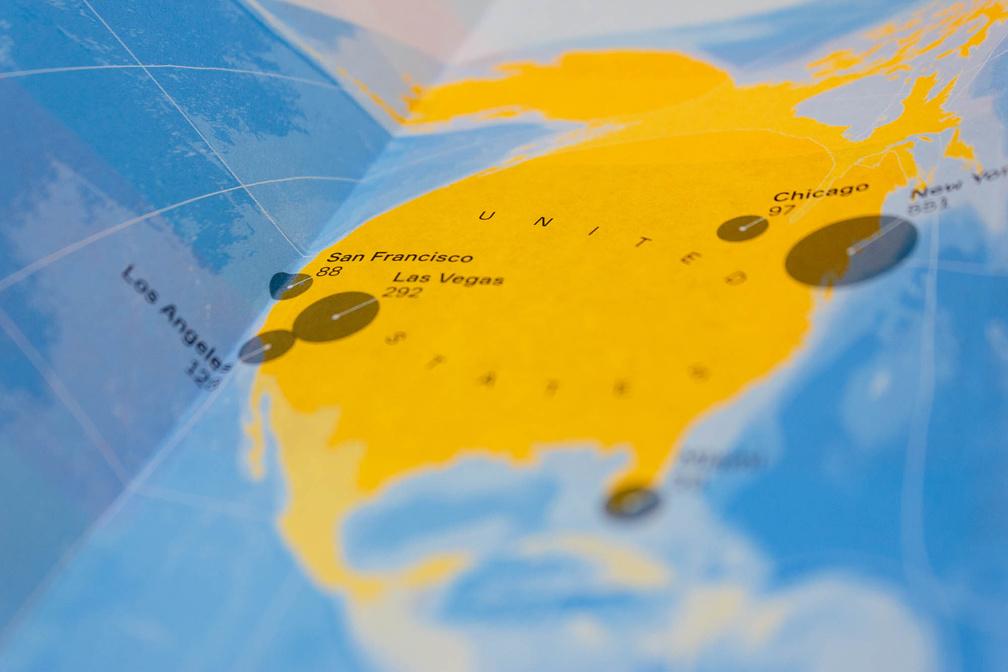

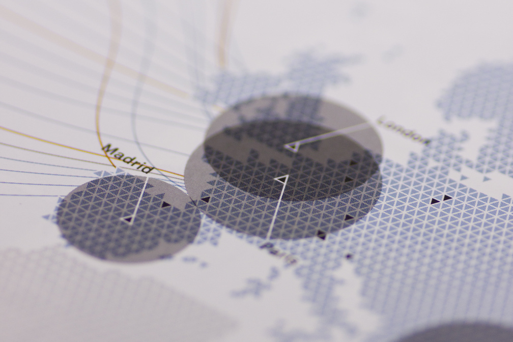
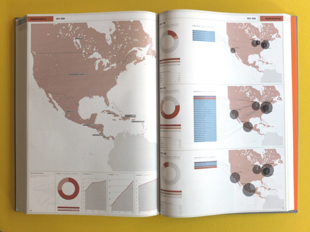
June 2017 – Annual report for DutchCulture, centre for international cooperation, Amsterdam (NL) visualising all cultural activities of dutch artists around the globe in 2016. All activities are sorted by country, city and discipline.
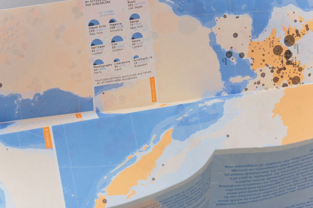
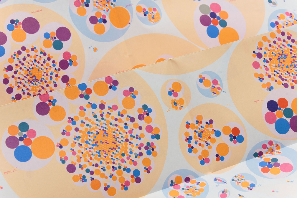
June 2016 – Annual report for DutchCulture, centre for international cooperation, Amsterdam (NL) visualising all 14,470 cultural activities of dutch artists around the globe in 2015. All activities are sorted by country, city and discipline.
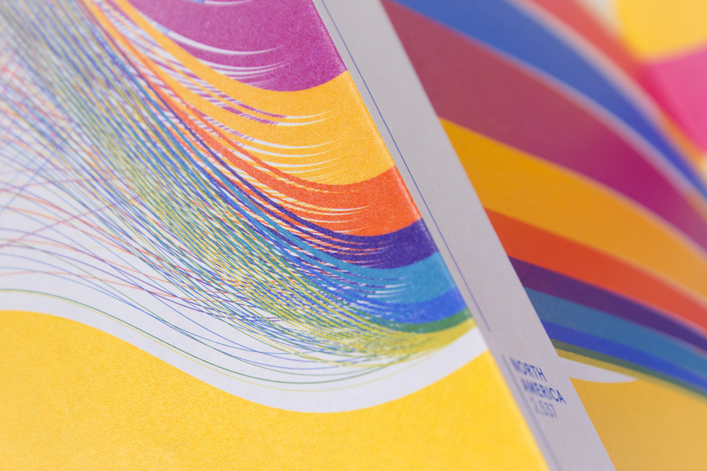
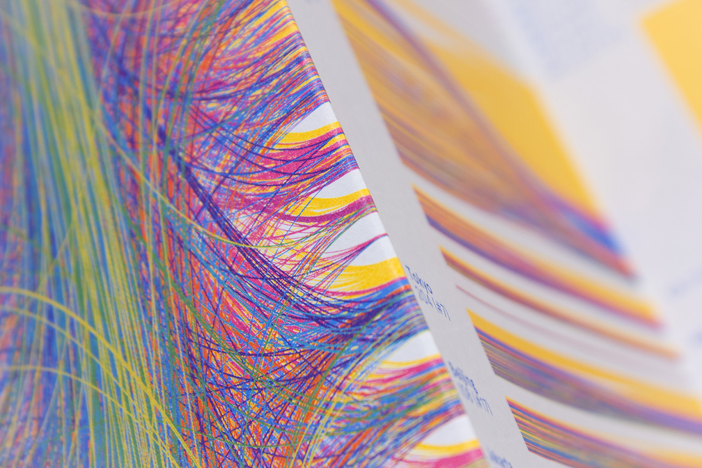
May 2015 – Annual report for DutchCulture, centre for international cooperation, Amsterdam (NL) visualising all 12,978 cultural activities of dutch artists around the globe in 2014. 12,614 activities took place in the top 50 countries and are split up by discipline, continent, country, city and traveller.

July 2014 – Book Design of 'Landscape and Energy' for HNS landscape architects – a book about the effects of the transition from fossil fuels to renewable energy on our environment.
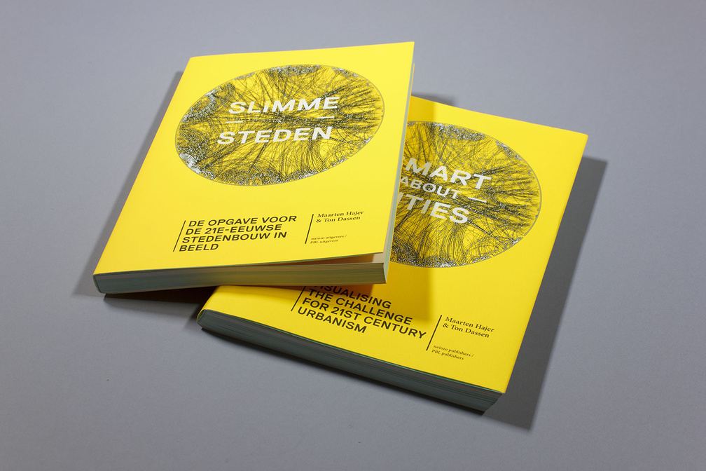
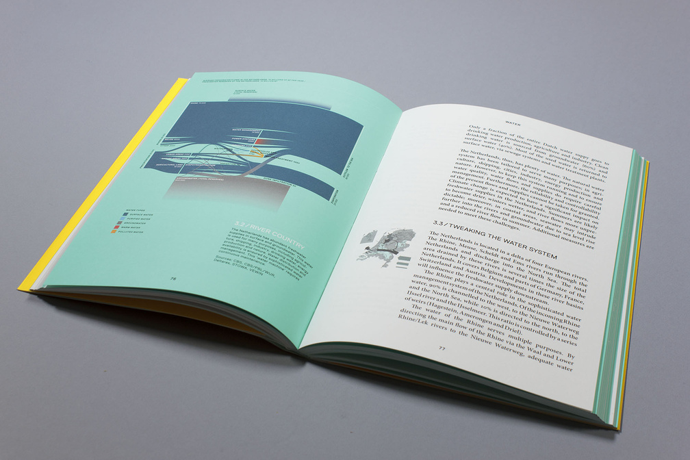
June 2014 – Book Design and Infographics for 'Smart about Cities' commissioned by PBL Netherlands Environmental Assessment Agency.
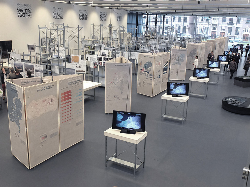
May 2014 – 45 large scale Infographics for IABR–2014–Urban by Nature, the International Architecture Biennale Rotterdam.
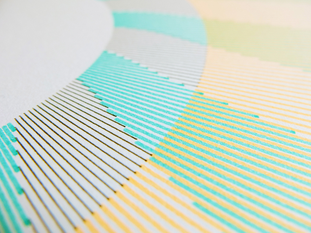
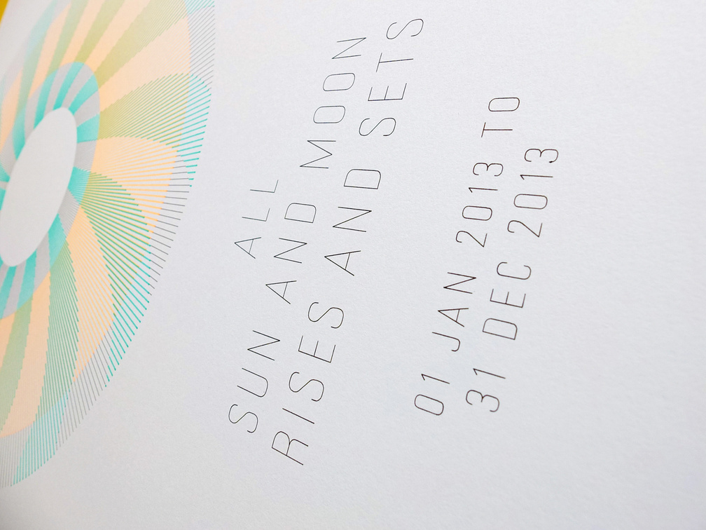
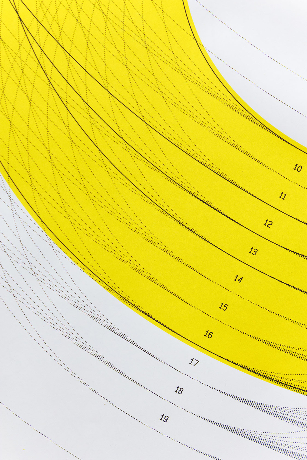
Sun & Moon
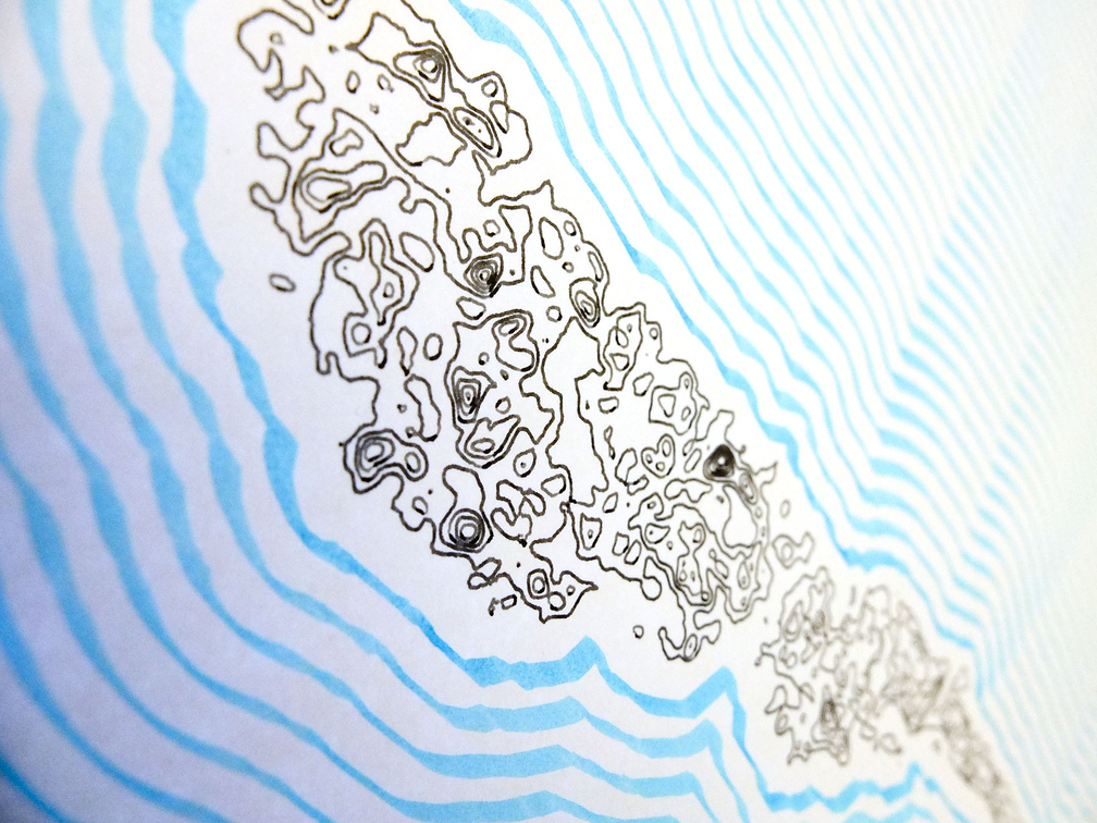
May 2013 – Periods of sun and moonlight for all days of 2013 (pen plot).
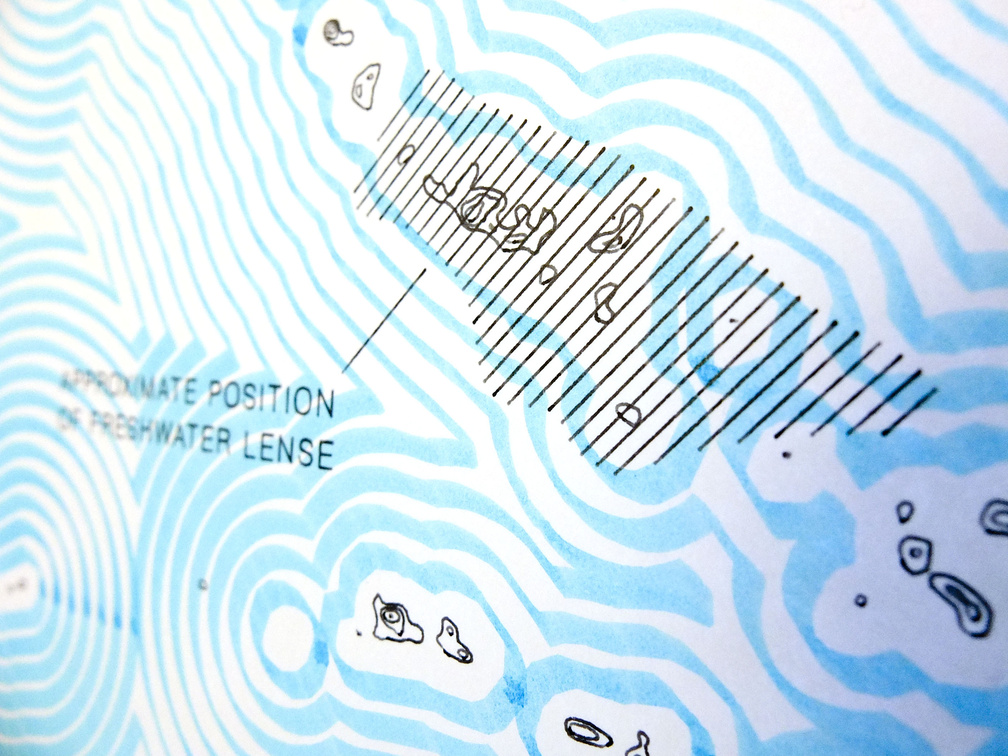
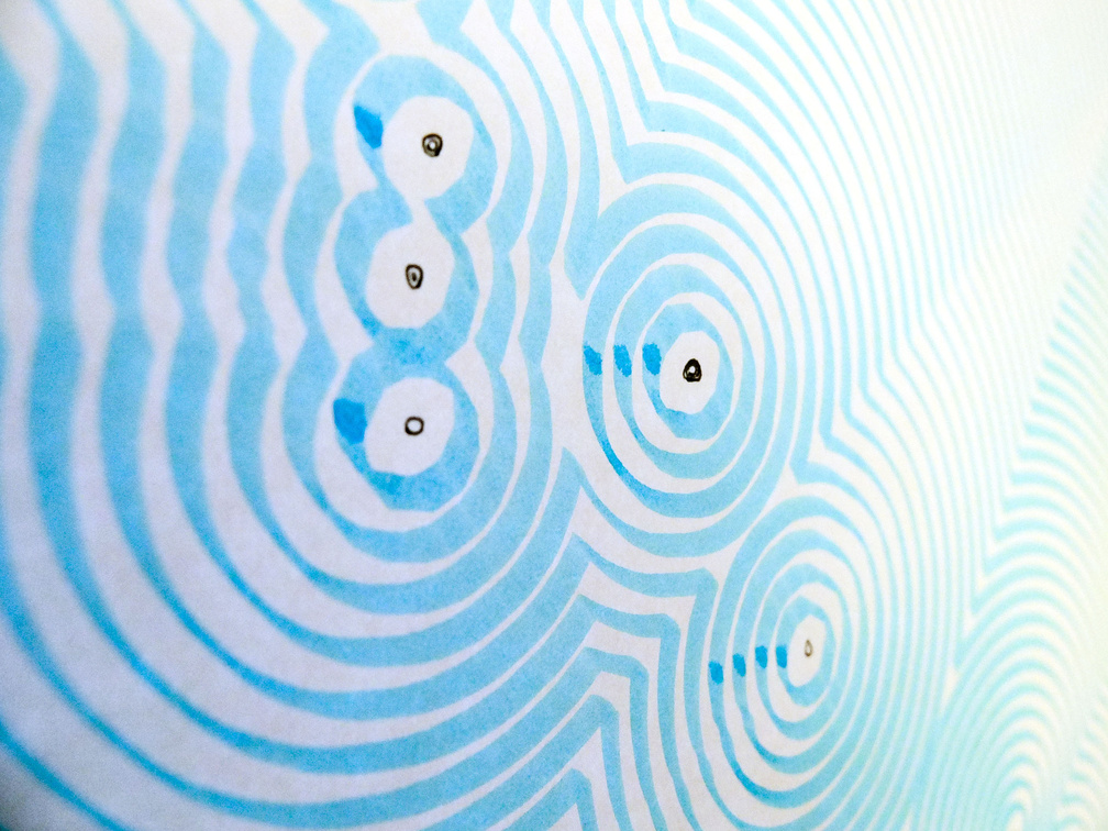
March 2013 – Series of four plotted posters about Tarawa which is part of the island nation Kiribati. With an maximum altitude of about 3 meters above sea level this could be the first nation which inhabitants have to be relocated in the next 50 years due to rising sea levels and pollution of drinking water.
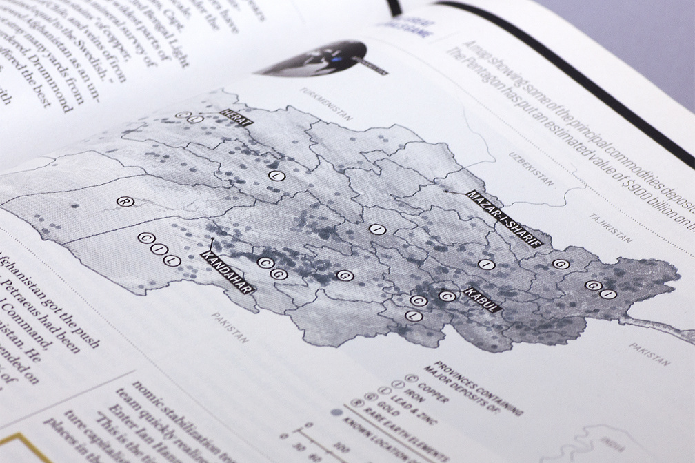
The Great Minerals Game
May 2011 – Map showing some of the principal commodities deposits in Afghanistan for Fortune Magazine, New York (US).
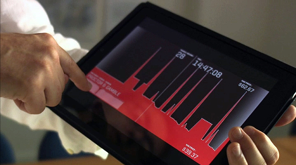
January 2011 – Together with Marije Meerman from VPRO Tegenlicht we developed a TouchDoc app for the iPad.
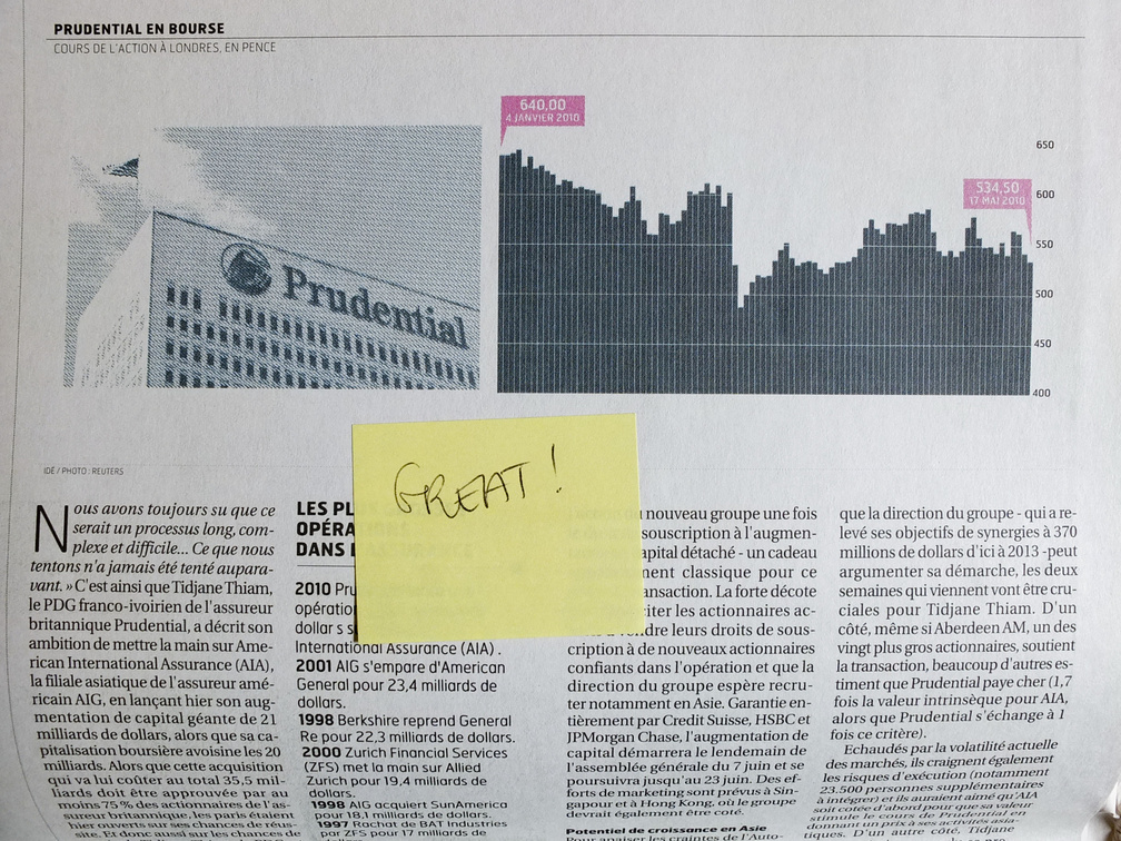
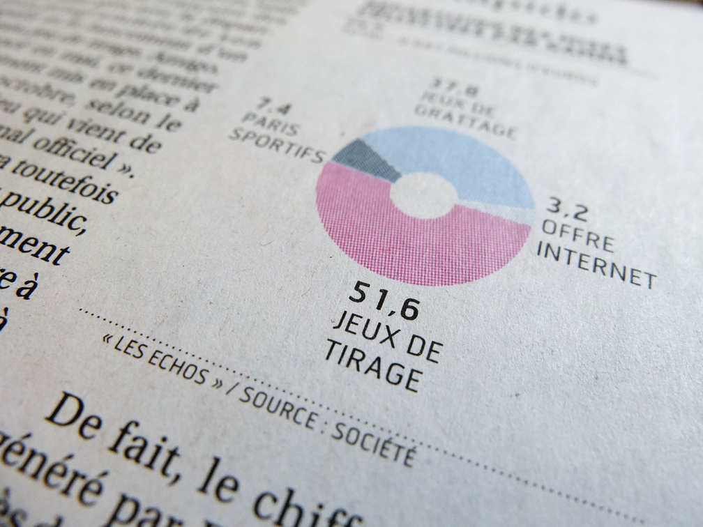
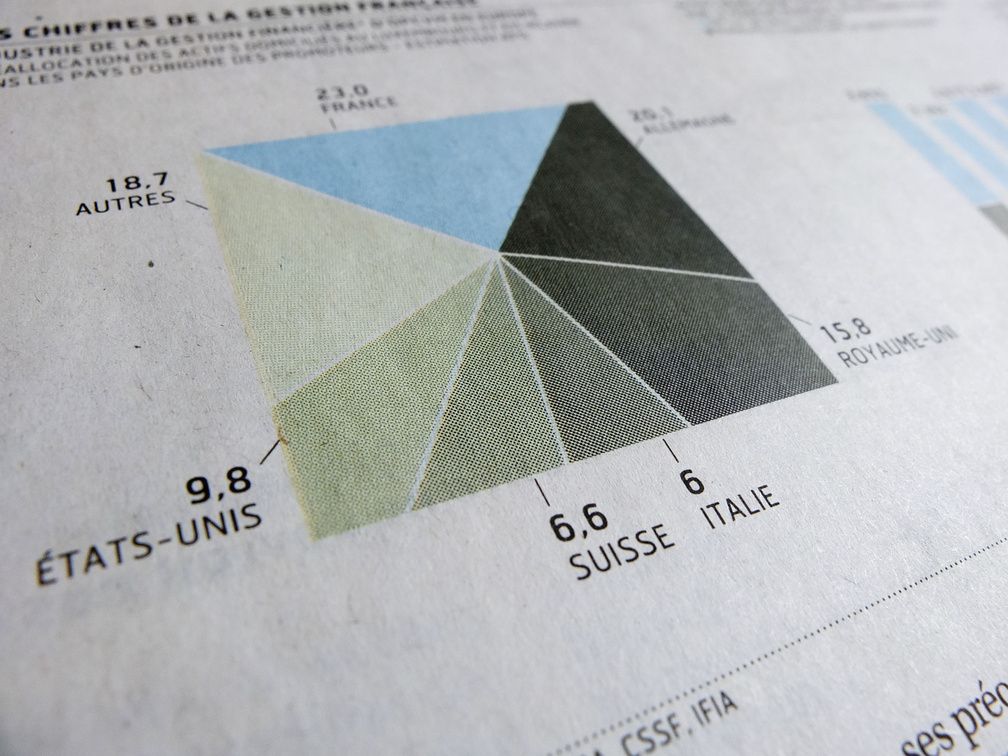
June 2010 – Redesign of all charts and data visualizations for the financial newspaper Les Echos, Paris (FR).
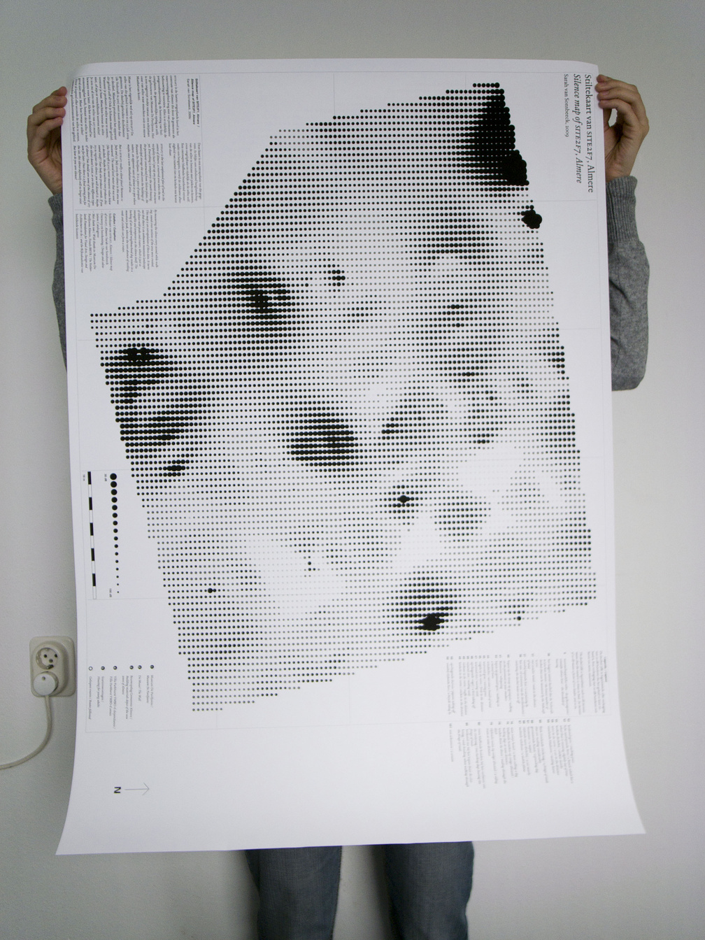
stiltekaart
August 2009 – Visualisaton of sound levels for Sarah van Sonsbeeck. Big dots (darker areas) represent silence as measured by Sarah on site 2F7 in Almere. In collaboration with Sarah van Sonsbeeck (concept, project) , Eva van Diggelen (curator) .
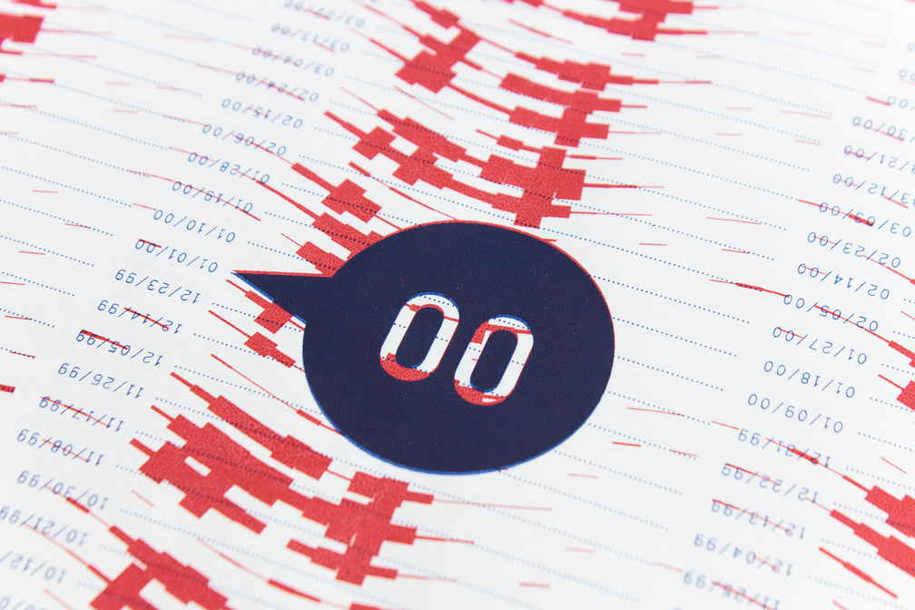
January 2008 – Poster series on Parking Violations by Diplomats in New York City, 1997-2005. Thanks to Ray Fisman and Edward Miguel for kindly permitting us to use their data.
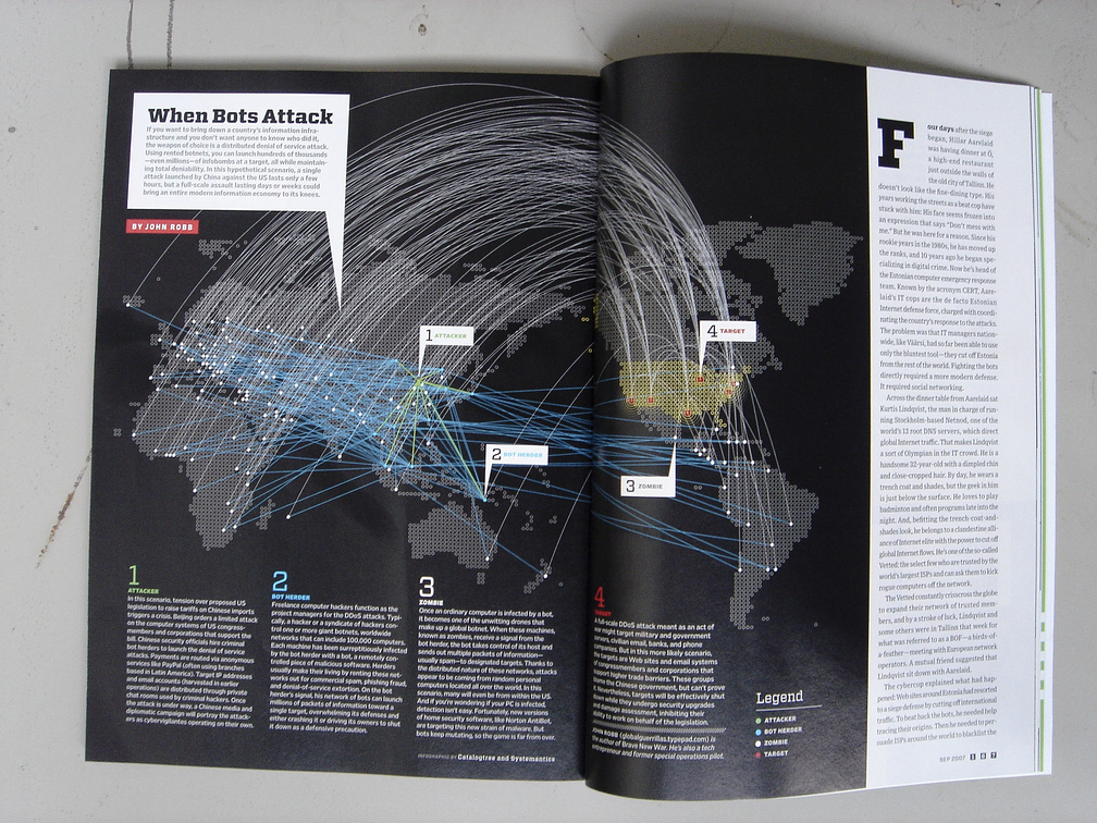
When bots attack
September 2007 – Illustration for WIRED magazine about a fictive DDoS (Distributed Denial of Service) attack on the US. In collaboration with Lutz Issler (postscripting) .